Bdan Beverages
Overview
There's a story about a man who wanted to take revenge on a friend who wronged him. Instead of destroying his friend's valuable wine collection, he quietly removed the labels from the bottles. In that single act, every rare and priceless bottle became just another drink on the shelf.
That story captures the essence of this project. Branding isn't decoration — it's user experience. In a market flooded with alcoholic beverages, creating a new product means creating emotional attachment. From the moment someone's eyes meet the bottle, to the moment they open it, taste it, and share it — it's all part of a journey.
In Bdan Beverages, I had the opportunity to help build a brand from the ground up. Working directly with the founder, I led the user research, brand identity, and product design, shaping the entire customer experience — from label to digital store.
My Role:
User Research, Brand & Graphic Design, Product Design
The Challenge
Breaking into the alcohol market is nearly impossible for small producers. Low production volumes mean higher costs, making it hard to compete on price. Our challenge was to build a brand strategy that bypassed traditional retail channels like supermarkets and liquor stores — and instead built a direct, emotional relationship with customers.
The Research
The alcohol market is saturated and competitive. To find our place, we focused our research around three guiding questions:
• What products should we lead with? (defining the right entry point)
• Who are our customers? (understanding audience and lifestyle)
• How can we stand out without competing on price?
We conducted taste tests, brand perception surveys, and consumer interviews to understand what emotions people associate with alcohol — and how they describe a "good experience."
We also researched buying habits and contexts — from casual gatherings to celebratory moments — to identify where our product naturally fits in.
Design Strategy & Key Insights
1. Positive Branding
Our research showed that most alcohol consumption happens during happy, social moments — weekends, family dinners, celebrations, or watching sports with friends. People use alcohol as a bridge to connection and self-expression.
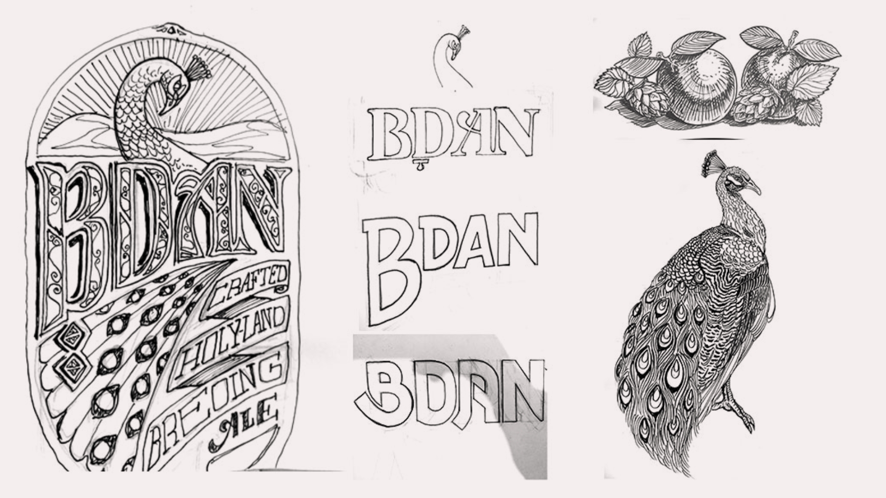
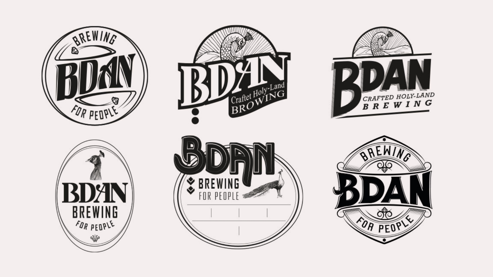
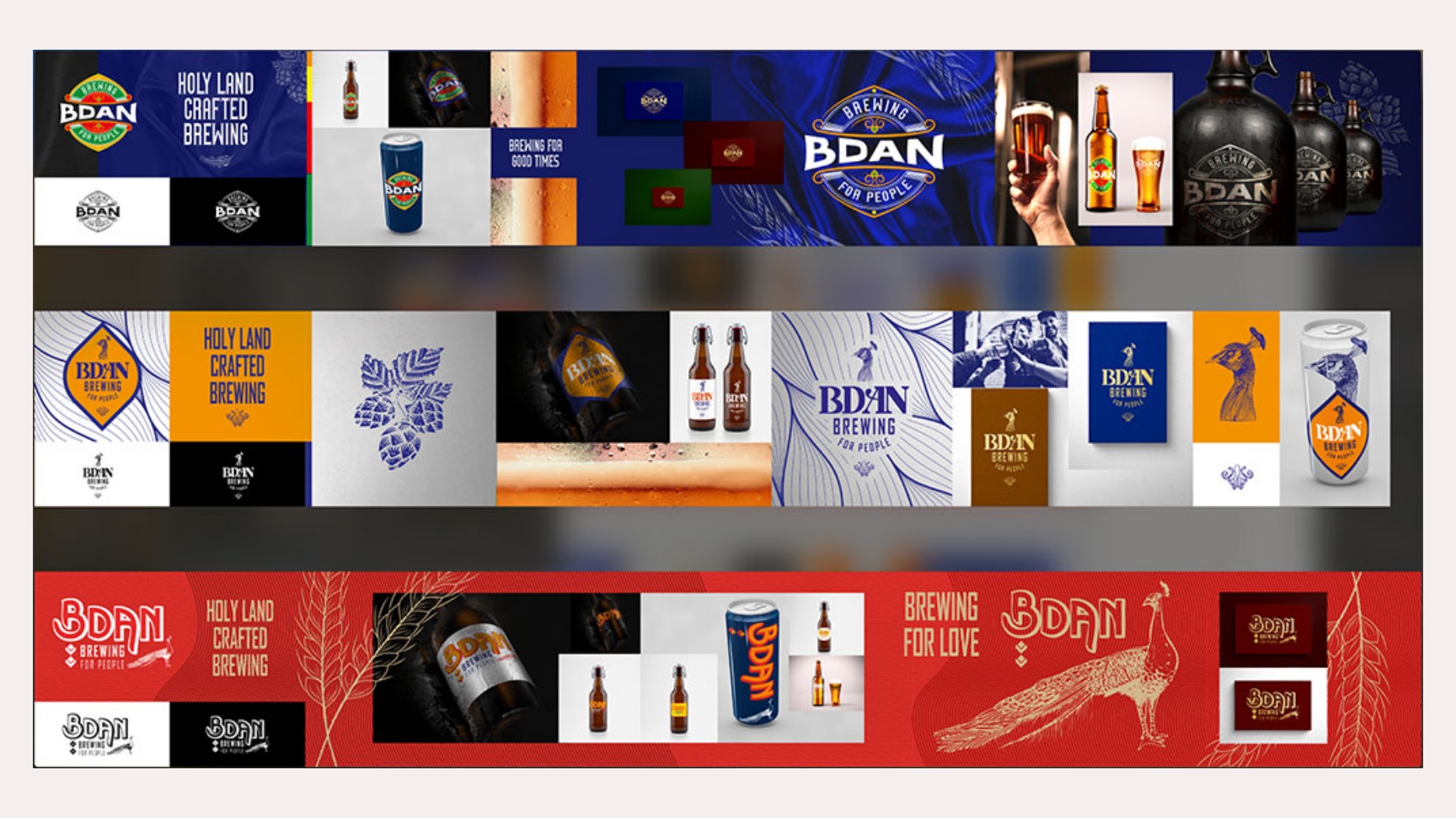
So, we decided to center the brand around positivity, confidence, and shared joy. The peacock became our symbol — a magnificent creature that knows its beauty and isn't afraid to show it.
This metaphor guided everything — color palette, tone, typography, and packaging language — positioning the brand as bold, joyful, and self-aware.
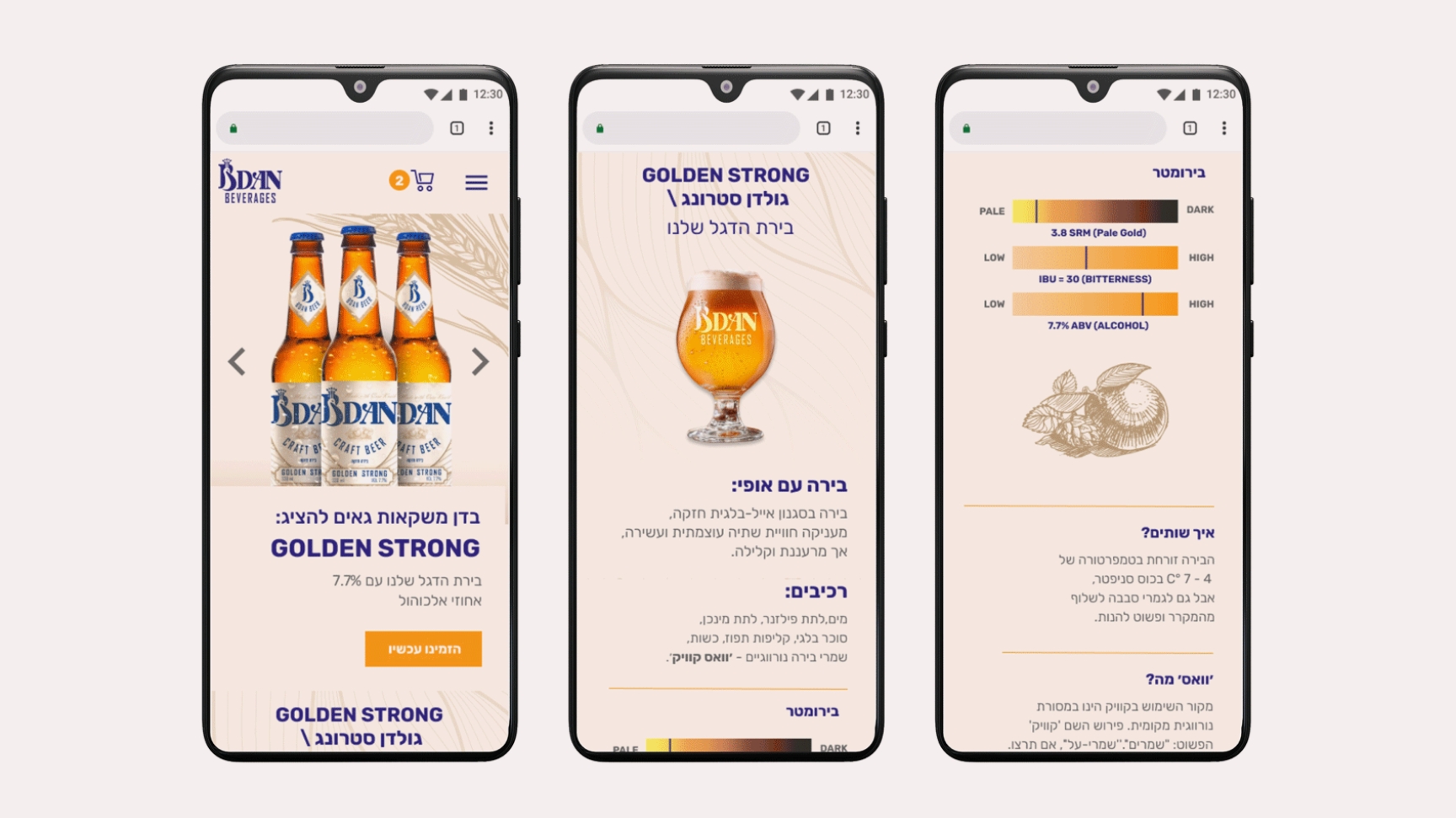
2. The Story on the Bottle
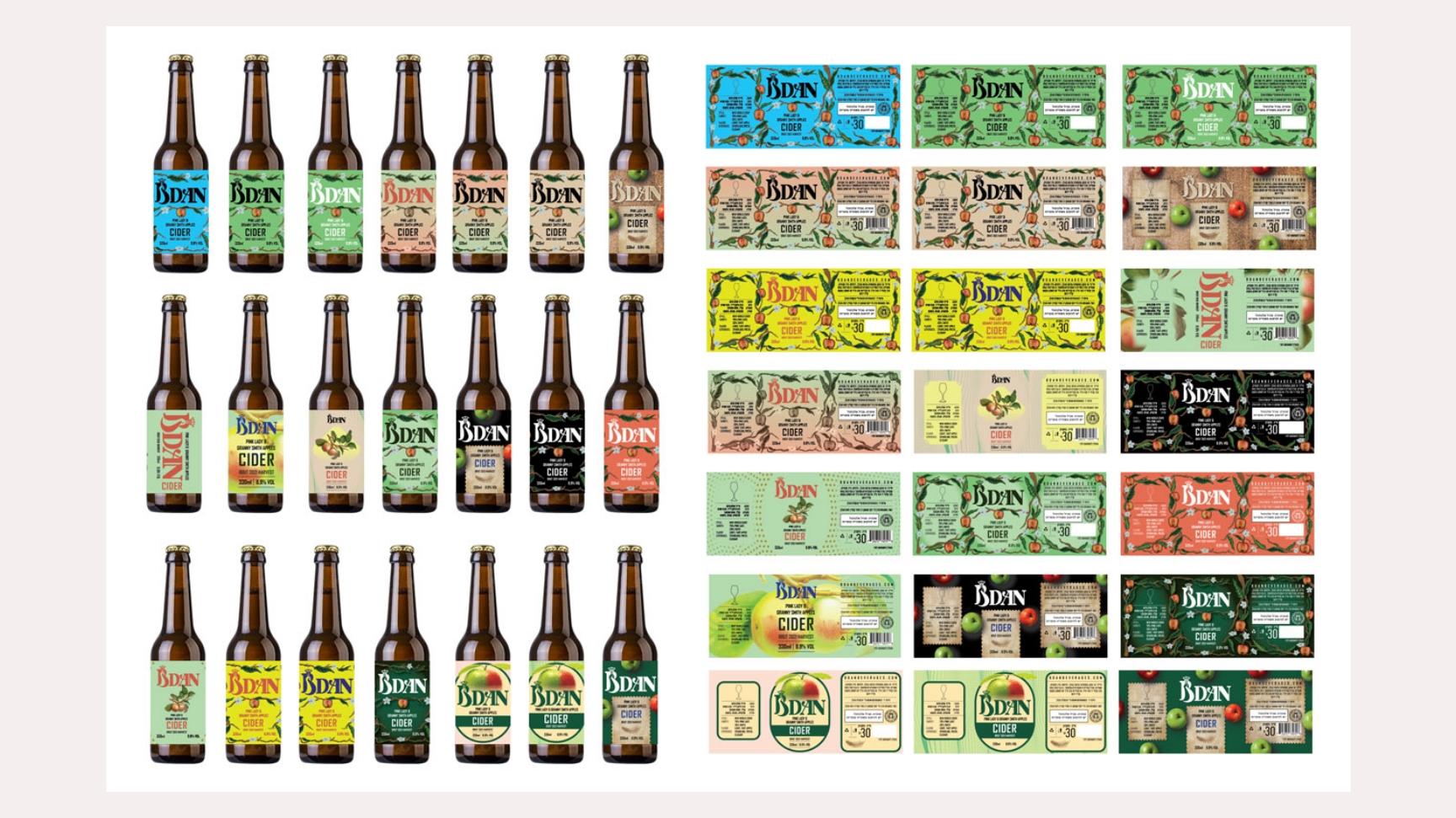
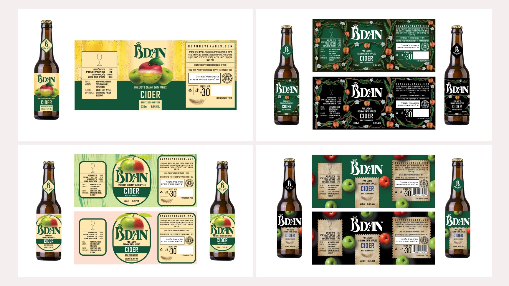
From a range of possible beverages (beer, cocktails, grappa, cider), we chose to focus on craft beer and apple cider — two approachable yet expressive drinks that let us tell a visual story through their packaging.
Each bottle label was designed not just as a marker, but as a story trigger — a conversation piece. We produced several label prototypes and tested them with 10 users to evaluate message clarity, shelf appeal, and emotional response.
Based on their feedback, we refined the design to balance authenticity (handcrafted look and feel) with modern distinctiveness that could stand out on a crowded shelf.
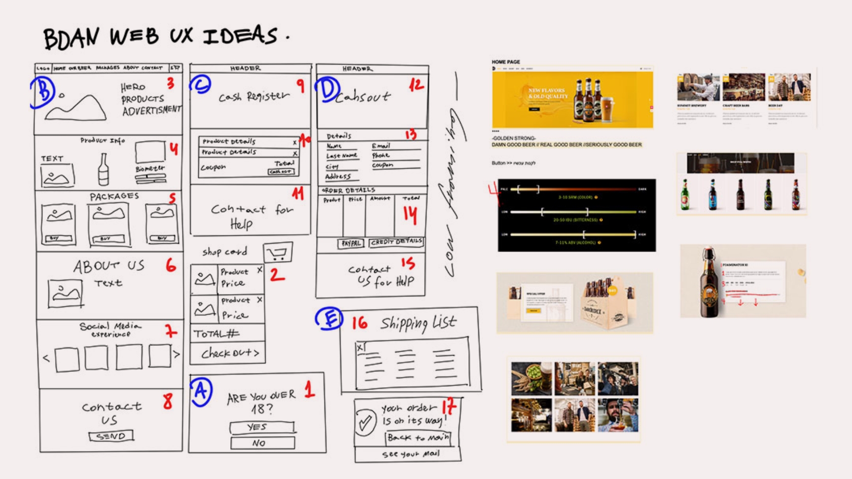
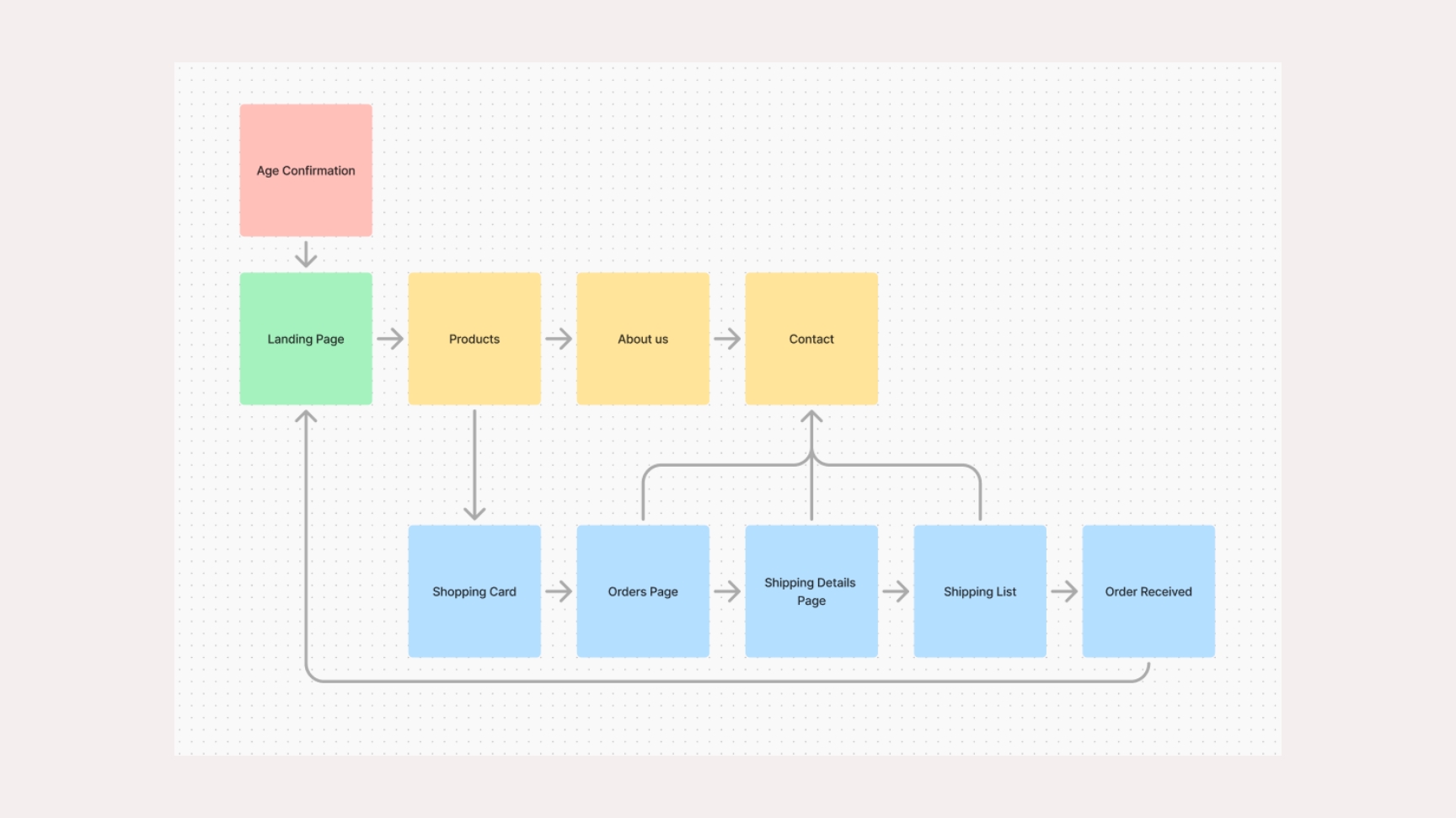
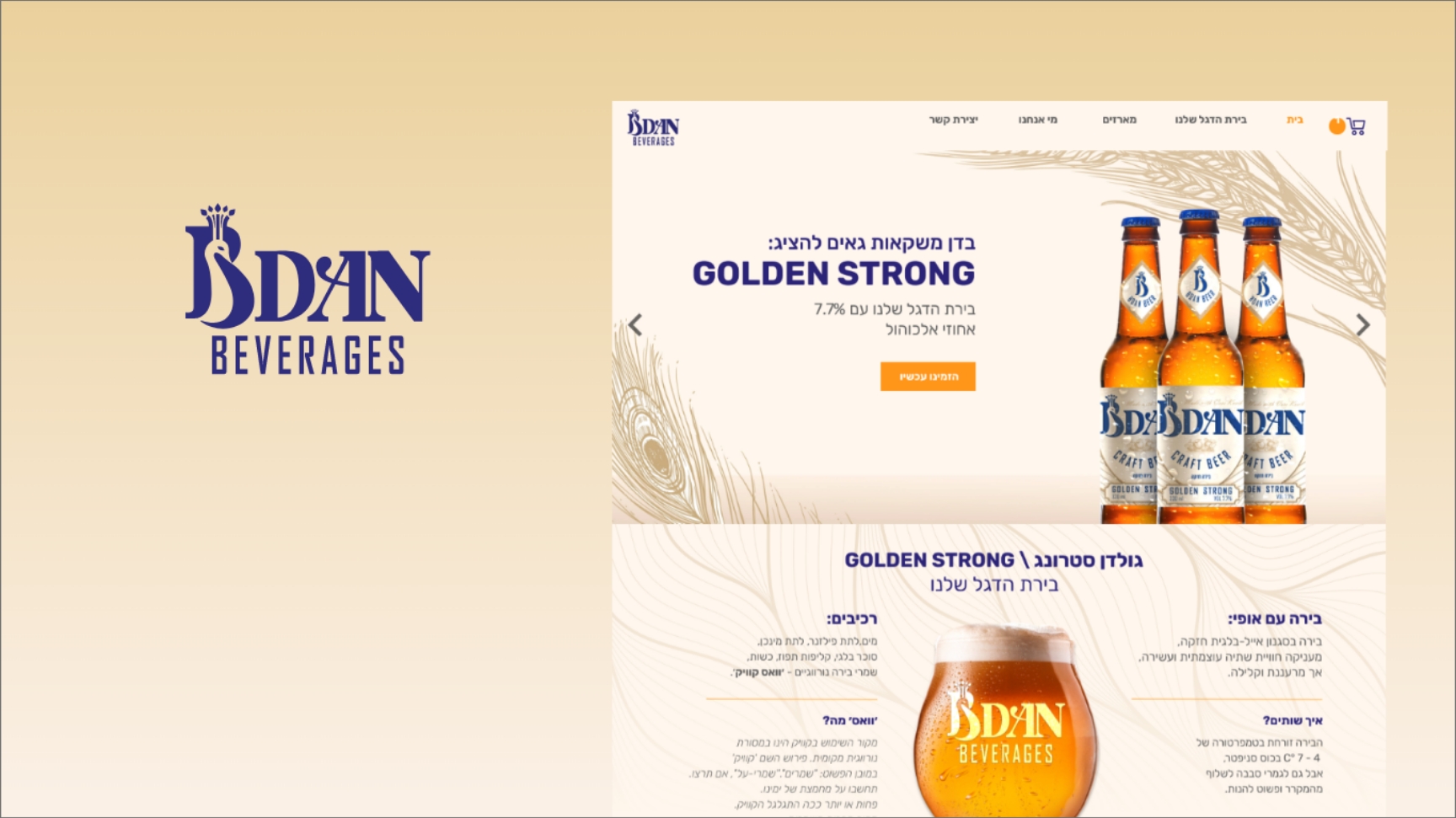
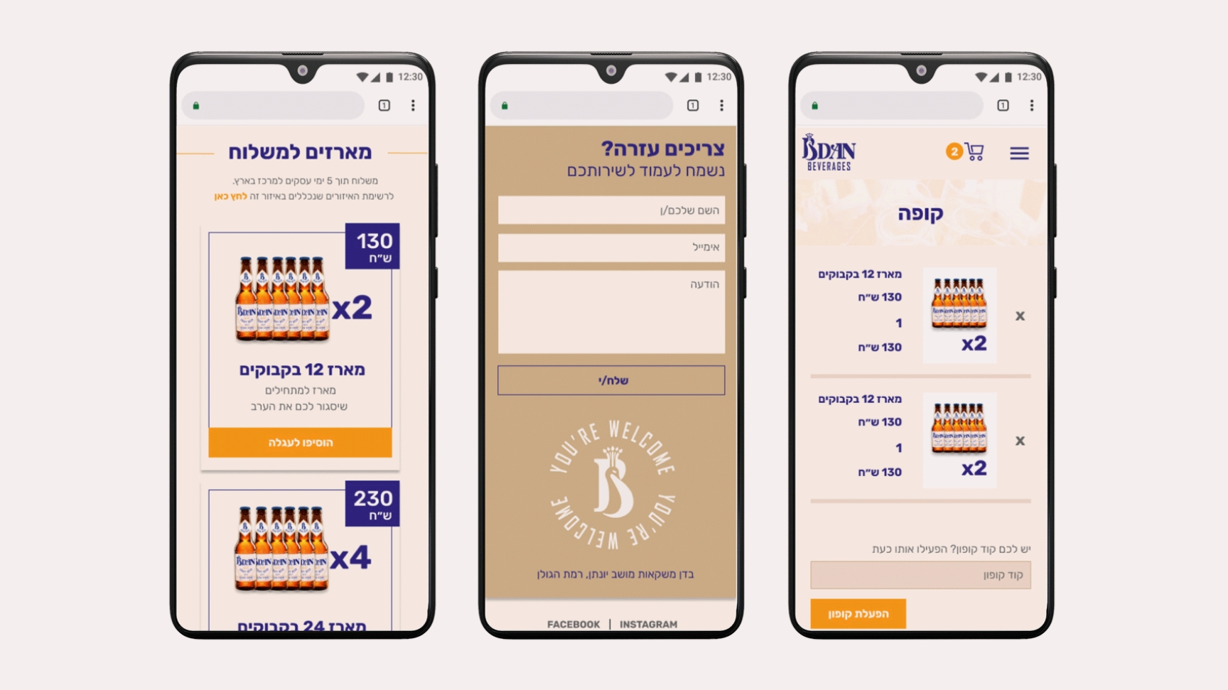
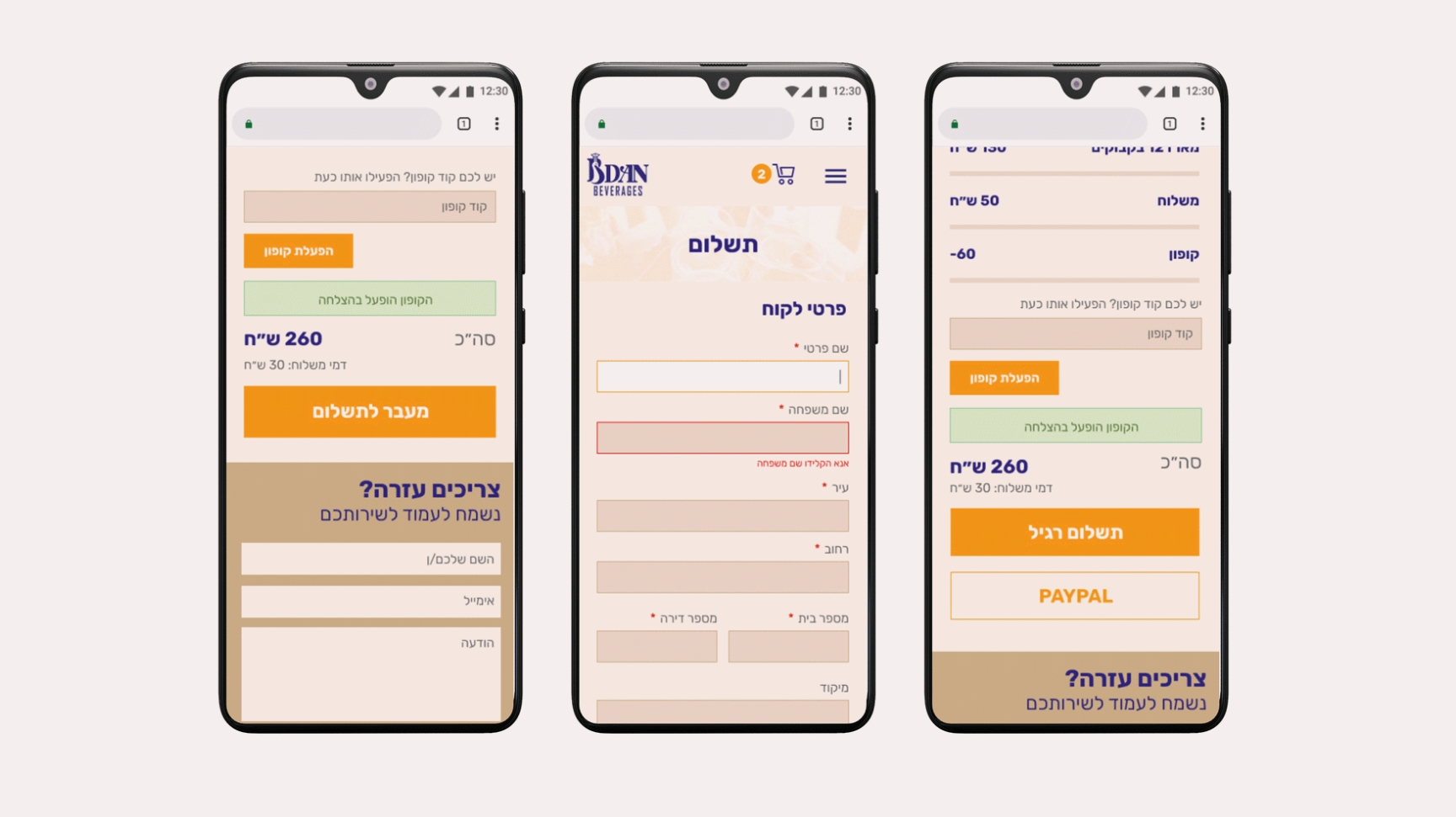
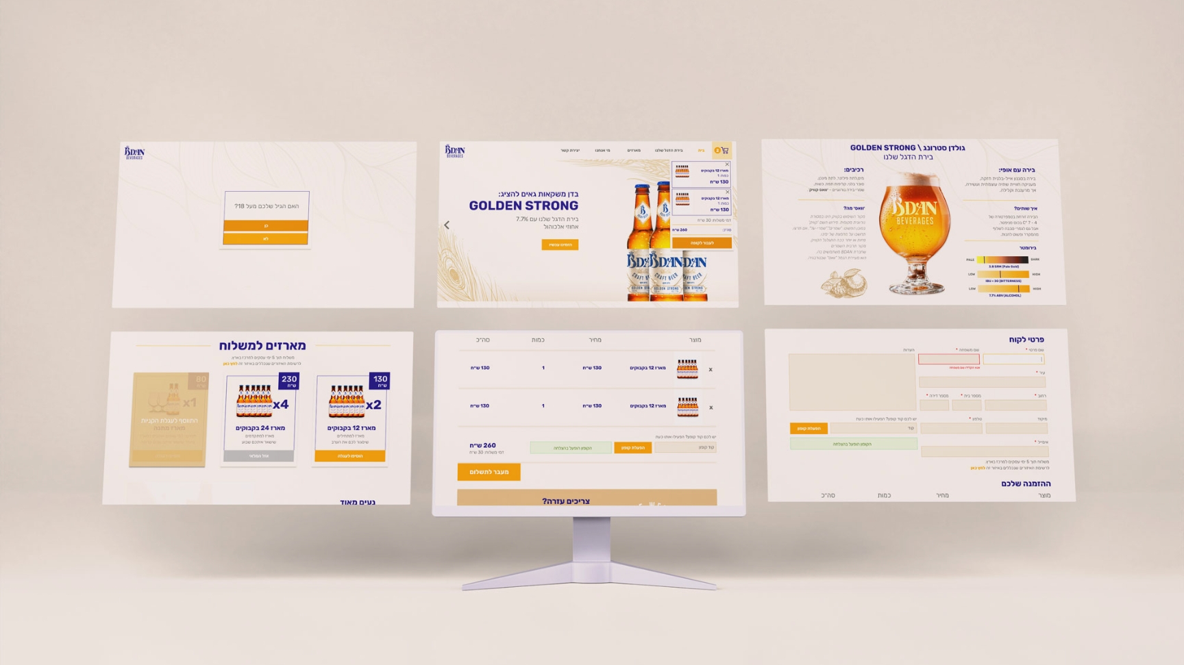
3. Digital Store Design
Since we couldn't rely on physical shelf presence, our online store became the main sales channel. We designed the eCommerce experience for desktop, tablet, and mobile, with a focus on familiarity and trust.
To guide our UX, we:
• Conducted competitive research on leading beverage brands' online stores.
• Distributed user surveys about ideal purchase flows and checkout pain points.
This helped us simplify the funnel, emphasizing quick product discovery, transparent delivery information, and personal reassurance at every step.
4. Designing Positive User Journeys
We mapped both positive and negative user journeys, focusing on how customers feel at each step.
From social media exposure → website visit → checkout → delivery, we identified potential stress points and designed interventions for each. One key insight from behavioral research is that people remember how an experience ends more than how it begins.
So we designed a personal touchpoint for every completed order — a thank-you message and direct phone contact option, letting customers know we were available and appreciative.
Impact
Bdan Beverages became a living example of how experience design extends beyond the screen — from digital journeys to the tactile moment of opening a bottle. By combining brand storytelling, product design, and UX thinking, we created a young, authentic brand that resonated emotionally with its audience and built its first loyal community entirely online.
Reflection
This project reminded me that great design is about empathy — not just usability. Whether it's a digital interface or a physical product, people are always looking for meaning, emotion, and connection. My role was to translate those feelings into form, story, and interaction — so that every bottle told a story worth sharing.